
Your website is often the first “team member” a potential customer meets. It can welcome visitors, explain what you offer, answer questions, and help turn interest into inquiries, even after business hours. A well-planned business website can introduce your company, answer common questions, build trust, capture leads, and guide visitors toward action at any hour. A conversion is a visitor completing a business goal, such as submitting an inquiry or placing an order.
Treat the site like a brochure, and it may simply sit there. Build it to serve your customers, and it can become a practical part of your business growth. Its role is to support your business goals, not guarantee results. Set one clear business goal for the site before deciding what it should look like.
Key Takeaways
- Give the site one clear business goal.
- Make key information easy to find.
- Show visitors how to take the next step.
- Keep the site useful after launch.
- Measure completed actions, not visits alone.
A Business Website Has More Jobs Than Sharing Basic Information
A business website is a set of connected pages that gives customers a place to learn about the company and interact with it. It can do more than display an address: useful pages inform, sell, share news, and make contact easier.
A website as a business tool template can begin with five core pages and one goal-specific page. Start with Home, Services or Products, About, and Contact, then add a page built around a particular goal, such as booking an appointment.
A live site is not finished if its information no longer matches the business.
What makes a set of pages a business website?
A website is a connected set of pages available through a web browser and usually organized under a domain. A business website can give people access to information, products, or services at any hour. Its pages might explain the offer, show current news, and point visitors toward a useful next step.
The 10 benefits of a website include an online presence, trust, search visibility, contact access, social connection, sales, news updates, expertise publishing, customer insight, and convenience. Those benefits depend on the pages being relevant and current. A small business can build a useful starting point without publishing every possible detail at once.
A website as a business tool template works best when its goal-specific page serves a real customer need. A service business might add a booking page, while a retailer could feature a product category. Keeping the page plan focused makes the site easier to maintain and easier for visitors to use.
Give visitors useful ways to connect
Give visitors practical options instead of making them guess which page or contact method to use. Useful actions include:
- Learn about the services.
- Check hours or the service area.
- Compare products or service options.
- Contact the business.
- Make a purchase or booking.
These actions help people move from browsing to a decision that fits their needs. A page should answer the questions that stand between a visitor and that action, without forcing them to hunt through unrelated content.
Keep the first screen focused on what the business does, who it serves, and one useful next step.
Building Trust With a Website as a Business Tool
A visitor is more likely to trust a business when its offer, expertise, and evidence are easy to verify. A clear value proposition explains who the company serves and what it does for them. Specific, verifiable details make a professional website more credible than broad claims.
Consistent branding helps customers recognize the business across pages, while plain language makes the offer easier to judge. Clarity matters when someone is deciding whether a company understands their needs.
State the offer and expertise plainly
Describe services in terms a customer can recognize. Name what is included, who the service suits, and what the process involves. For example, a cleaning company can describe which spaces it serves and how customers arrange a visit, rather than relying on phrases such as “top-quality solutions.”
Relevant credentials help visitors assess specialized work. State the credential by its real name and explain its connection to the service. A license, certification, or professional membership belongs on the page only when the business holds it and can confirm its status.
Useful content also sets boundaries. If a service is offered only in certain areas or for certain project types, say so in a visible place. That detail helps the right customers see a fit and lets others avoid an unnecessary inquiry.
Match proof to the promise
Four trust cues help a visitor judge a company: a clear business identity, relevant credentials, details about the service process, and customer evidence. Each cue should connect to the actual offer. A named team member, an outline of project steps, or a real customer review gives people something specific to assess.
Customer reviews and endorsements should reflect real experiences. They should not promise results the business cannot support. A testimonial about one customer’s experience does not prove every customer will receive the same outcome, so present it in context.
Generic testimonials can create doubt when a visitor cannot tell what service they describe. A short endorsement becomes more useful when it identifies the type of work or customer experience, with permission and accurate wording.
Keep the tone and details consistent across pages so the brand feels like one business, not a collection of unrelated claims. Use a named credential or a specific process detail only when the business can substantiate it.
A Clear Visitor Journey Turns Attention Into Action
A visitor who lands on a service page needs a clear reason to keep reading and a clear next step when ready. A useful website design connects page content to the questions visitors have at each point. Plan the path around four stages: Attention, Interest, Trust, and Action.
Each stage gives users a reason to continue. A clear path might begin when someone notices a service, then learns how it solves a problem, checks evidence, and requests a consultation.
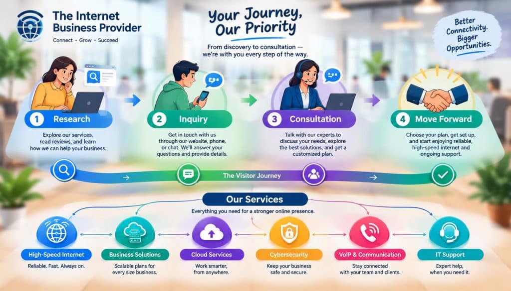
Map the visitor journey in four stages
Attention starts with a useful headline or page that matches what brought the visitor there. Interest follows when the page explains the service and why it may suit the visitor. Trust grows when the person can assess relevant evidence. Action is the moment they take a suitable next step.
| Stage | Visitor question | Suitable page content or action |
|---|---|---|
| Attention | Is this relevant to me? | Service headline and clear audience |
| Interest | How could this help? | Service details and outcomes |
| Trust | Can I rely on this business? | Process details and customer evidence |
| Action | What should I do now? | Consultation request or order |
The same sequence can work for different business goals. A visitor might apply for a job, register for an event, request an estimate, or place an order. A conversion does not have to mean a sale; it can be any completed action that matters to the business.
Put a call to action where intent is clear
A call to action (CTA) should describe the step in language visitors understand. “Book a consultation” is clearer than “Continue” when the page offers a consultation. Keep the label consistent with what happens next, so visitors know whether they are starting a form, choosing a time, or placing an order.
Unclear labels make people stop and reconsider. Unnecessary clicks can interrupt the path when visitors must open several pages to find basic service details or contact options. The page order should help people answer one question at a time, not make them retrace their steps.
Review the path from the visitor’s point of view. If a person needs more information before acting, place that information near the action rather than hiding it elsewhere. Remove any click that does not help the visitor understand, decide, or act.
Mobile-Friendly Design and Accessibility Remove Friction
A page that looks polished on a desktop can still be frustrating to use on a phone or with assistive technology. Responsive layouts adjust to different screen sizes, while readable type and clear controls help people use the site. Test real tasks on small screens and with assistive technology, not just a desktop preview.
Touch targets should be easy to select without tapping a neighboring link. Small details, such as a clipped menu or crowded form, can block a customer from completing a task.
Design for phone screens and touch
A responsive design rearranges layouts to fit the screen instead of shrinking a desktop page into a narrow column. Keep essential information visible and avoid layouts that require side-to-side scrolling. Menus should open and close clearly, and buttons should have enough space around them for touch use.
Check that body text remains comfortable to read without zooming. Images should fit their containers, and important page elements should not overlap when the screen gets smaller. Test navigation, search, and a complete customer task on an actual phone when possible.
Some people navigate without a mouse, using a keyboard or assistive technology. A site should let them move through links and controls in a sensible order. Visible focus indicators show which element is active, and captions or text alternatives can make media meaningful to more visitors.
Make essential information accessible
Accessible forms use clear labels, explain required fields, and identify errors in a way people can understand. Do not rely on color alone to show an error or success state. If a visitor cannot tell which field needs attention, even a short form can become difficult to complete.
The U.S. Department of Justice’s 2024 ADA Title II rule sets WCAG 2.1 Level AA as the technical standard for web content and mobile apps provided by covered state and local governments. The rule’s deadlines apply to those governments, not automatically to every private business.
Under the 2026 extension, governments serving 50,000 or more must comply by April 26, 2027. State and local governments serving populations under 50,000, along with special district governments, must comply by April 26, 2028.
A visual preview alone can miss keyboard traps, unclear form labels, or content that a screen reader cannot describe. Check mobile navigation and essential tasks with both keyboard access and a screen reader, not only a visual preview.
Speed and Search Visibility Shape the Experience
A page can be attractive and still lose visitors if it loads slowly, shifts unexpectedly, or makes key information hard to find. Website performance includes how quickly the main content appears, how quickly a page responds, and whether its layout stays put. Google’s good Core Web Vitals targets are LCP within 2.5 seconds, INP below 200 milliseconds, and CLS below 0.1.
LCP, or Largest Contentful Paint, measures when the largest visible item loads. INP, or Interaction to Next Paint, reflects how quickly a page responds to user input. Stable layouts support a better experience, while a high CLS score means page elements shift more than the target allows.
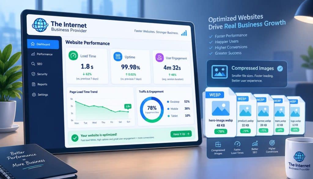
Check loading, responsiveness, and layout stability
Google Search Console provides a Core Web Vitals report for checking page performance. Use it to see which pages need attention, then look for a specific cause, such as oversized images or scripts that delay loading. A change to one part of the site can affect how quickly other parts appear.
Compressed images usually take less time to load than large, unoptimized files. Remove scripts the site no longer needs, and check whether page elements move while content loads. A page that jumps as a visitor tries to click can cause a mistake even when it eventually loads.
Run a practical set of checks before focusing on a single score:
- Image size and compression.
- Unnecessary scripts.
- Mobile loading.
- Navigation links.
- Core Web Vitals status.
Make pages discoverable through useful content
Search visibility begins with pages that answer a real customer need. Use a clear page title and descriptive headings so visitors and search engines can tell what each page covers. Relevant service content should use the terms customers know, not just internal names for products or processes.
Each page should have a distinct purpose. A service page that gives useful details can better match a customer’s intent than a short page filled with broad claims. Keep the navigation links working so visitors can reach the information they came to find.
A strong performance score cannot compensate for confusing content or broken pages. Use the Search Console report to identify pages that need attention, then test one performance change at a time.
Lead Capture Works Best When the Next Step Is Clear
A useful call to action makes it obvious how a visitor can move from interest to a conversation, booking, or purchase. The right marketing tools depend on how your business serves customers. A lead path needs a clear CTA, a short form or booking step, and a confirmation or response process.
Choose the path that fits the business model rather than adding every available feature. Useful web-based tools examples include contact forms or CRM systems, email marketing, appointment scheduling, and payment processing.
Offer a useful way to make contact
A service business may need an inquiry form or appointment booking, while a retailer may need online checkout. A newsletter signup can suit a business that shares useful updates with its target audience. Social media links can help visitors find the company’s profiles, but should not replace a direct way to get in touch.
Each option has a distinct role. A contact form collects a request, booking software helps visitors choose a time, email marketing supports opt-in updates, and checkout accepts an order. Google Analytics can help track visitor behavior and traffic sources, so you can see which paths people use.
| Tool category | How it connects to the website | Business task supported |
|---|---|---|
| Contact form or CRM | Form sends details to a contact system | Receive and manage inquiries |
| Email marketing | Signup form adds opted-in subscribers | Send business updates |
| Appointment scheduling | Booking page displays available times | Arrange customer appointments |
| Payment processing | Checkout accepts payment online | Complete customer orders |
Connect inquiries to follow-up tools
A form should collect only the details needed to respond. Asking for more personal information than the business needs can discourage a visitor and create extra work. A short form might request a name, a way to reply, and a brief description of the request.
Tell visitors what happens after submission. The confirmation can say that the request was received or explain how a booking is recorded. Make sure the business has a reliable way to receive the inquiry and a person responsible for responding.
Choose tools that fit the team’s actual process. A contact form that sends messages to an unattended inbox is not a useful lead path. Ask only for details needed to respond, and tell people what will happen after they submit the form.
Regular Updates Keep a Website Useful as the Business Grows
A website can stop reflecting the business long before anyone notices a technical failure. A monthly review helps you catch changes in customer needs, offerings, and site content. Review business-critical pages and conversion tracking each month, then update time-sensitive details as soon as they change.
Simple analytics can show where visitors come from and which actions they complete. Compare traffic sources with inquiries or bookings, not just page views. Useful data gives you a basis for deciding which pages deserve a closer look.
Set a recurring maintenance routine
Check that the business’s main pages still describe current services, products, hours, and staff. A page can remain online while its details become inaccurate. Waiting until a customer reports an outdated phone number or broken booking link can cost time and disrupt an intended action.
Website maintenance also includes working links and forms, backups, security updates, and a check of hosting and domain details. Backups give the business a copy of site information if a problem disrupts the live version. Security updates help keep the platform and its components current.
Hosting and domain records deserve attention because the site depends on them to stay available under the right address. Keep renewal details accessible to the people responsible for the site. A missed message about an account or renewal can create an avoidable interruption.
Measure outcomes against business goals
Use a monthly check to compare traffic sources, completed inquiries or bookings, and engagement with important pages. If a key page gets visits but few people take its intended action, review whether the page answers the questions visitors need resolved. Avoid treating traffic volume as the only measure of value.
Changes in staff, services, products, or hours can affect both page content and how customers complete a task. Make timely edits when those business details change, then test the affected pages and forms. This keeps practical information aligned with the way the company operates.
Use the numbers to identify a specific issue, not to make changes for the sake of activity. A small adjustment to a page can be easier to assess than a broad redesign. Recheck the phone number and booking link whenever staff, hours, or services change.
The Tradeoffs of DIY and Ongoing Website Support
A DIY builder can be a practical starting point, but the right choice also depends on who will manage the site after launch. A website builder may reduce setup work, while platform limits and responsibility for updates or security can make later changes more demanding. The advantages and disadvantages of a website depend in part on your capacity to manage it.
Control has value: a site lets your business manage its brand information, customer access, and measurable marketing activity. The tradeoffs include ongoing upkeep, security responsibility, platform limits, and time spent managing content.
Consider four points before choosing a path:
- Desired level of control.
- Available staff time.
- Technical complexity.
- Support needed after launch.
A DIY route is a poor fit when complex integrations or frequent changes need support that your team cannot provide.
Some small businesses can manage a simple site in-house, especially when one person has time to update it. Complex integrations or frequent changes can demand more technical knowledge and ongoing attention than a DIY platform makes practical.
IBP can design, build, optimize, and maintain a website around a company’s goals. Those four workstreams can be planned together or handled in stages, depending on the business’s priorities and capacity.
For a site with complex integrations or recurring changes, weigh ongoing support before choosing a DIY route.
Conclusion
A website works best when its purpose is clear to both the business and its customers. A focused project can help you make useful choices about content, design, and the work needed after launch.
Start by naming the single action you want customers to take. That choice gives your first project brief a practical measure of success and keeps website design tied to business goals rather than appearance alone.
A website can support growth when its content, visitor experience, and upkeep fit the way the business serves people. Write down the one action customers should take, then use it to shape a focused project brief with IBP.