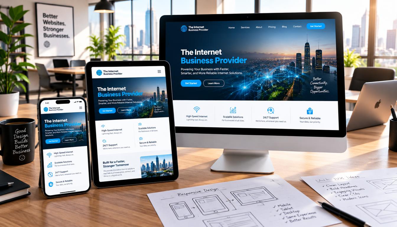
Customers often browse, compare, and buy from a phone, tablet, or desktop. If a page feels cramped on a small screen, they may leave before they find what they need. Mobile responsive web design helps a business serve visitors on the device they already use.
MDN describes responsive web design as an approach that adapts sites to different screen sizes and conditions. Ethan Marcotte coined the term “responsive design” in 2010. Today, flexible layouts, media queries, and a well-set viewport help keep text, menus, and forms useful as space changes.
That flexibility can support a better user experience: visitors can read key details, tap controls, ask questions, or make a purchase with less effort. Clear, easy steps help build the confidence to act.
This guide covers practical ways to improve content and navigation, simplify forms, and test pages on real devices. You’ll also see how IBP can help you plan a useful next step.
Key Takeaways
- Adapt layouts and forms to the space each device provides.
- Keep essential details easy to find and read.
- Use clear controls to support inquiries and purchases.
- Test pages on real phones before launch.
- Explore practical improvements with IBP.
What Mobile Responsive Web Design Means Beyond Shrinking a Desktop Page
Responsive design changes how a page arranges its content and navigation as space shifts. Ethan Marcotte coined the term in 2010. The goal is not to squeeze a desktop layout into a narrow column, but to keep key tasks clear across different screen sizes.
Layouts that reflow as space changes
HTML text can flow naturally, while CSS grids and media queries help organize columns, menus, and images. A viewport meta tag tells a browser to match the viewport width to the device. Without it, MDN notes, some phone browsers may use a 980px viewport. Media queries can then adjust styles as a browser window grows or shrinks.
“3-inch screen” is a metaphor for limited viewing space, not a fixed target. People use phones, tablets, watches, and televisions, so one screen size cannot guide every choice. For example, a page might stack its container and show a compact menu on a phone, then use two columns on a tablet. The content stays useful while its layout changes.
| Page feature | Fixed desktop layout | Flexible layout |
|---|---|---|
| Navigation | May crowd a narrow screen | Can shift to a compact menu |
| Content | May require side-to-side scrolling | Can stack for easier reading |
How Mobile Usability Builds Customer Confidence
Trust often starts with a simple moment: a visitor can tell what to do next. Clear offers and easy actions help turn interest into a call, enquiry, or sale. Less friction gives people more reason to act.
Make it easier to enquire, call, or purchase
On a phone, visitors should be able to read key details and tap a clear contact action. Responsive navigation can help them find prices, services, or hours without searching through crowded menus.
For example, media queries can help a layout adapt to smaller sizes. Contact elements can stay easy to reach, while the content remains legible. A visitor should not need to zoom just to understand an offer or take the next step.
Keep key information clear across devices
Good web design keeps essential information visible as the screen size changes. The same user experience should work across devices, with a useful layout and interactive elements that remain easy to use.
Figma reports that 74% of online users are likely to revisit a site with a mobile-friendly design. Treat this figure as an indication of value, not a promise for any business. A consistent experience across each device can support confidence and repeat visits.
- Make the next action clear.
- Keep contact details easy to find.
- Present important information in a readable way.
Adapt Content and Navigation to the Available Space
When visitors arrive with a clear goal, the page should help them reach it without extra steps. A focused design puts useful information first and makes key actions easy to find.
Prioritize useful content on phones
Lead with what people need most, such as services, hours, or contact details. Consider their task instead of simply removing desktop content. A responsive web approach can adjust content order, images, and other elements for different screen sizes. Keep a clear reading path as the layout changes.
CSS and media queries can guide those changes. At a suitable viewport width, use media rules to adjust the layout for the device and its available space.
Simplify menus without hiding essential pages
A compact hamburger menu, accordion, or tabbed navigation can reduce clutter. Keep labels clear and touch actions easy to use. Good web design makes essential services, contact details, and information pages simple to reach—not hidden behind confusing choices.
| Navigation choice | Best use | What to keep clear |
|---|---|---|
| Hamburger menu | Short list of main links | Menu label and key pages |
| Accordion | Grouped links or details | Section names and open state |
| Tabbed navigation | Related content choices | Tab names and selected item |
Use Flexible Layouts, CSS, and Media Queries
A strong responsive web design starts with flexible rules, not a separate fixed page for every device. CSS Grid and Flexbox let a fluid grid share content as the viewport width changes. This keeps the layout useful across different screen sizes.
Let fluid grids and images fit the viewport width
Set images and videos to max-width: 100% so they stay within their container. They can shrink to fit without stretching past it. A viewport tag with width=device-width, initial-scale=1.0 also helps a browser use the device’s actual screen width.
Set breakpoints where the layout needs to change
Use media queries when content needs a new arrangement. MDN shows a one-column layout shifting to two columns at 600px. Its example also applies styles when the viewport reaches 80rem. W3Schools shows three columns stacking at 800px or less. Treat these values as examples, not fixed rules. Choose each breakpoint when the layout needs more or less space.
| Example threshold | Layout change | Useful when |
|---|---|---|
| 600px | One column becomes two | Content has room to sit side by side |
| 800px or less | Three columns stack | Narrow widths make columns cramped |
| 80rem or wider | Styles apply at a wider viewport | A page needs room for added elements |
Make Text, Tap Targets, and Page Layouts Comfortable on Phones
Small details can make reading and tapping feel easy—or frustrating. Clear text and well-spaced controls help visitors use a page without zooming or hitting the wrong action.
Use readable font sizes and well-spaced controls
Choose a font size and line length that suit phone screens. If content feels cramped, use CSS and media queries to adjust styles. MDN’s example sets a heading to 2rem by default, then raises it to 4rem at widths of at least 600px. This shows how responsive design can adapt to different screen sizes.
Leave enough room around links and buttons. Comfortable tap targets help people select an action with confidence.
Prevent horizontal scrolling on narrow screens
Keep each layout within the viewport. Set the max-width: 100% property on images and video so they fit their container. Fluid elements can stop content from extending past the screen width and causing side-to-side scrolling.
Check the page in a browser window at several sizes, then test it on an actual device. This simple example can reveal whether text, controls, and other elements fit the available space.
Make Mobile Forms Easier to Complete
A form can turn interest into a sales call or a lost lead. A thoughtful design makes the next step clear and helps visitors feel at ease.
Before: a difficult enquiry form on a phone
Imagine a long form with crowded fields, tiny controls, and many required answers. On a phone screen, a visitor may need to zoom and scroll to finish. These elements can make a simple task feel hard.
After: a short form with clear fields and click-to-call links
In this example, the business asks only for a name, contact detail, and brief message. Clear labels, good spacing, and an obvious submit button create a clean layout. The fields fit the available width inside the form container. Media rules can help the page adjust to the device and browser.
- Keep only details needed to reply.
- Add a click-to-call link near the form.
- Make the submit action easy to spot.
“A clear next step turns interest into action.”
Figma notes that calls to action can guide users toward sales. The goal is not to cut useful content, but to reduce friction. A smoother user experience helps visitors complete the task with confidence. This practical web design choice can make an enquiry easier to send.
Keep Important Content Consistent Across Devices
Visitors need the facts they came for, whether they browse on a phone or a desktop. A thoughtful design keeps useful details within reach as screen sizes change.
Preserve useful text, images, and page elements
Keep service details, contact information, and key calls to action available. Responsive design can shift the order of content to fit each layout without removing facts people need to make a choice.
MDN explains how the <picture> element, srcset, and sizes help browsers select an image for a viewing context. CSS media queries can also adjust page elements for a device and screen width.
For a fluid container, MDN recommends the max-width: 100% property. It helps images fit their space instead of pushing past it and disrupting the layout. Check that each image remains clear at its displayed size.
“Keep useful information available wherever people choose to browse.”
Consistent content supports informed decisions across devices. Review each page to confirm that text, images, and functional elements still work well for phone users.
Understand How Google Uses Mobile Content
Google uses the mobile version of a page for indexing and ranking. So, important information should remain available when people visit from a phone. Clear, consistent details help both visitors and search systems understand what each page offers.
Keep important information available
Retain useful service details, text, and page elements instead of removing them just to simplify a small screen. Responsive web design can arrange content in a clear way while preserving the facts people need.
Check that the browser can access key information at the intended viewport width and size. Media queries may change a layout, but they should not hide essential details from users or search systems.
Support discovery without guarantees
Responsive design helps people reach useful information across devices. Still, it does not guarantee higher rankings or more organic traffic. Google makes ranking decisions based on many factors.
Keep information aligned across web pages. This supports mobile discoverability and serves visitors who use different devices. Treat content access as sound practice, not a promise of search results.
| Check | Good practice | Why it matters |
|---|---|---|
| Key details | Keep service facts available | Visitors can make informed choices |
| Layout rules | Use queries to adjust presentation | Content stays easy to reach |
| Search expectations | Avoid ranking promises | Results depend on many factors |
Improve Website Responsiveness and Speed Separately
A page can fit a phone well and still load slowly. These are separate goals, and visitors notice both. A clear layout helps people find information, while faster loading keeps delays from getting in their way.
Match layouts to screens and optimize performance
Responsive web design describes how a layout fits the viewport at different screen sizes. It does not guarantee fast delivery. For example, one large image scaled down to fit a phone screen may waste bandwidth and look poorly suited to that device.
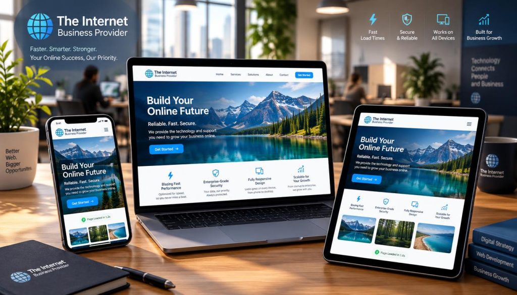
MDN recommends tools such as <picture>, srcset, and sizes to send suitable media. Pair these with optimized image files, rather than assuming flexible CSS styles or queries will speed up a page.
First, check that each image fits its container and that the layout works in a browser window. Then assess loading time separately. Good design supports both a useful experience and efficient delivery.
| Check | Layout goal | Performance goal |
|---|---|---|
| Phone viewport | Fit content to screen width | Serve an appropriate image size |
| Desktop browser | Keep the layout clear | Limit large media files |
Test Key Customer Journeys on Real Phones
A page that looks right in a browser window may act differently when someone taps it. Test the steps customers use to contact your business or place an order on real phones and tablets.
Check screens, browsers, and touch actions
Check different screen sizes and browsers. Open menus, tap links, and read the content without horizontal scrolling. Try the page at several points around each breakpoint. MDN’s example shifts from one column to two at 600px, so check both sides of that width. Also test the viewport, screen width, and layout on more than one device. CSS and media queries can change how page elements appear, but hands-on checks reveal issues that a browser alone may miss.
Test forms and pages on slower connections
Complete an enquiry from the first field to submission, then tap the click-to-call link. Repeat the journey on a slower connection to spot large images or delays. A useful test covers the full task, not just how the page looks.
- Try key actions on phones and a tablet.
- Check links, menus, and readable content.
- Look for media delays that interrupt a task.
“Test the task, not just the screen.”
Real-device checks help catch problems before they cost a customer.
Turn Mobile Improvements Into Better Business Experiences
A useful digital visit should move a person from a question to a confident next step. Visitors may need to find a service, understand an offer, contact a business, or complete a purchase. Good design keeps each task clear and simple.
Readable content, clear navigation, and well-planned forms help a site feel dependable on a phone. Fewer obstacles can make it easier to move from a first question to a completed inquiry. That smoother user experience can support stronger customer relationships.
Figma reports that 74% of online users are likely to revisit a site with a mobile-friendly design. Treat this figure as context, not a promise. A consistent web experience can give people a reason to return.
Assess the full customer journey, not just how a page looks in a browser. Check the viewport, screen width, and layout at different sizes. Review media files, too, so each image suits its size.
- Can visitors find key information?
- Can they understand the offer and contact you?
- Can they finish the task across screens?
Real journey checks show whether changes help customers take action.
Work With IBP on Practical Usability Improvements
Every improvement should help visitors complete a task and support a clear business goal. IBP works as a practical partner, helping businesses choose useful changes over complexity for its own sake.
Connect each choice to a customer need
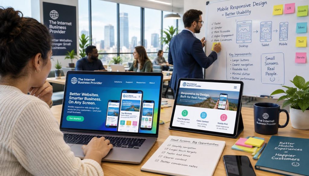
A focused web design review can uncover ways to clarify content, simplify navigation, or make enquiry forms easier to use. The right design decisions depend on how customers move through your site—not on adopting a tool just because it is popular.
Figma lists options such as Bootstrap, Pure CSS, Foundation, Semantic UI, jQuery, and Tailwind CSS for responsive projects. These tools can help teams create responsive pages, but the best choice depends on your site, its media, and its goals.
IBP can review the layout, touch actions, and content across devices. The review can check how pages work at different screen sizes and width settings, including relevant CSS queries. Then, you can focus on changes people can use on each device.
- Start with customer tasks and business goals.
- Identify achievable usability changes.
- Choose tools that fit the project.
Discuss a practical next step with IBP. Together, you can connect the customer journey to the result your business wants.
| Review area | Practical question | Potential improvement |
|---|---|---|
| Content | Can visitors find key details? | Clarify priority information |
| Navigation | Can visitors reach key pages? | Simplify menu choices |
| Enquiry form | Can visitors send a request? | Improve fields and touch actions |
Conclusion
A useful site earns trust by making the next step feel simple. Good responsive web design adapts content, navigation, and layout to each visitor’s screen. It does not force a desktop page into a narrow view.
Keep text readable, controls easy to tap, menus clear, and forms brief. Add click-to-call links and prevent side-to-side scrolling. Keep key facts available across devices. Google’s use of mobile content makes consistency important, but it does not promise better rankings.
Responsive design should work alongside faster loading. Test real customer tasks on phones and slower connections. Check calls, forms, and menus from start to finish.
Talk with IBP at theinternetbusinessprovider about practical improvements for your site.